
|
||||||||||||||||||||||||||||||
5.6 Relationships between SST and chlorophyll |
||||||||||||||||||||||||||||||
References:
Images: MER_RR_1COLRA 20030424~.N1 Description
Download image
|
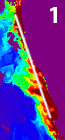
In the last section you looked at composites from two different sensors over the same time period. In this section you will be looking at how temperature and chlorophyll, from the same platform and time period, compare. You can do this by comparing MERIS data to Envisat AATSR data from the same period. However, to do this you would first need to create a composite of 8 or 9 AATSR image. If you wish to do so, the relevant AATSR images have been made available. However, to save time, we will use the two MODIS Level 3 data sets here. The principles behind the comparison are the same for both MODIS and the two Envisat sensors. Start by opening the file l5_mod_a20040332004040.L3m_8D_SST_4.hdf.
Subsampling the imageThe file is a global image, so just like when you compared the different sensors you need to extract the study area, to do this: Hint: you may need to setup the geographical grid before doing this, if you cannot remember how see section 5.
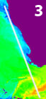
Open the MODIS composite modis_8day_chla.dat that you prepared in section 5. Set the stretch to logarithmic, the null value to zero and the upper data value to 4 and have a look at the two files. You should be able to instantly see the similarities and pick out the same features in each image. Converting the dataUnfortunately the data in the SST file is not in an appropriate format for comparison, so we need to convert the data to °C Open the formula modis_convert_algal.fm and familiarise yourself with its contents.

You can now close all files except Close all the files except SST_l3m_8d_extract.dat and modis_8day_chla.dat.
Apply the stretches you decided on in your answer question two before continuing. Looking at the dataThe data is now ready for analysis, you are going to use similar tools to those you used in section 5.1 to compare the sensors to look at correlations between temperature and chlorophyll. Start by stacking the images. Right click on one of the images and select connect. Select the two images in the connect dialogue and make sure that stacked is ticked. Click OK. Visual analysisYou are going to start by simply looking at the two images, in the sst image a darker colour represents a cooler sea, in the chlorophyll image a lighter colour higher chlorophyll.
You may want to experiment with different stretches to pull out different features of the image. For example, using the MODIS chlorophyll image set the stretch to a maximum of 2. This will expose detail in the ocean further from the upwelling. Hint: it is best to do this on images that are not stacked, applying a stretch to a stack will apply it to all the images.
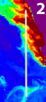
Select your stacked images and use the cursor to examine a selection of high and low chlorophyll points in different parts of the image. Use the tab key to flick between the SST and chlorophyll images, noting the data values displayed on the Bilko status (bottom right corner of the Bilko window). Take some time to do this, it should reinforce your visual analysis of the image. Finally we will use the Bilko transect tool to investigate the image. Select your image stack and take three transects:
Once you have drawn on your transect, with the line tool, right click on the image and select new transect document, make sure apply stretches is unticked. You should be able to see that the chlorophyll concentrations are very small compared to the temperatures, making them hard to compare. Bilko does not support multiple scales on an axis, so to compare the two variables on the same graph we would need to extract the data and analyse it in another application. If you wish to do so, this is easily done, simply click the copy button on the Bilko tool bar, open a spread-sheet in another software package and paste the columns corresponding to the two transect lines. In Bilko you can do this by creating two separate transect documents:
|
|||||||||||||||||||||||||||||
|
Answers: |
Another way to see the relationship between the two images is the use of a scatterplot between the two data sets:
You will see that the scatter plot has a similar problem to the transect, in that most of the chlorophyll values are very low. You can also do a combined histogram for the two images by selecting New » Histogram document. Use the [TAB] key to move between them.
|
|||||||||||||||||||||||||||||
|
|
|||||||||||||||||||||||||||||