|
Overview
Example output:
(Resizable pop-up)
Colour composites
References:
List of journal references
Download tools
formulas, palettes etc.
(5 KB)
Images:
MER_RR_1COLRA 20030424~.N1 Description
Download image
(31 MB)
Useful information:
The Benguela Current System
Coccolithophore blooms
|
Coccolithophore blooms are highly reflective, so they are easily seen from space in all the visible bands of ocean colour sensors such as MERIS. Detection of these blooms usually takes place using Level 1B (top of atmosphere data), as the bright nature of the bloom may trigger quality flags during atmospheric correction. The bright turquoise blooms appear at their most spectacular when presented as true colour images. You will do this here, with a coccolithophore bloom that occurred in the southern Benguela in April 2003.
Activity:
Open the image MER_RR_1COLRA20030424~.N1 and spend a little time looking at the file structure. The N1 format is ESA's data format for single L1 and L2 scenes from Envisat. It is a hierarchical data format - i.e. it comes with all the metadata (descriptive information) and ancillary data-sets you need in order to process and analyse the images:
-
the Metadata contains information on orbits, time of acquisition, sensor bands etc.; in this lesson you will need to refer to the MPH and the SPH for information, so spend a little time becoming familiar with these;
-
the Flag codings describe the processing flags for the image (more about these later), and
-
the Tie point grids contains the georeferencing information for the 71x71 tie-point grid that links the image pixels to specific positions on the Earth's surface.
Selecting suitable bands
Colour composite images are created by mapping three bands to the colours red, green and blue in the computer display. In a true colour composite the wavelength chosen for each of these colours is close to the wavelength that the human eye perceives as
-
red (about 620-670nm),
-
green (about 520-570nm), and
-
blue (about 440-480nm).
|
True colour composites are a good way of displaying TOA radiance data. In the SPH (special product header) part of the metadata you will find the wavelengths of the MERIS bands given as integer values. Dividing these by 1000 gives you the relevant wavelength in nanometres (nm).
Question 1
Which bands would you select for a true colour composite of this MERIS data?
(In some instances you will have the choice of more than one band - for best results try to avoid choosing adjacent bands).

Activity:
To open the bands you selected you must open them and connect them as a Bilko SET. The simplest way is to open all three together and apply the same stretch to all three:
Select the Bands folder in the left frame to display all the bands in the right frame. In addition to the 15 TOA radiances, there is also flags and a detector_index file, which contains numerical values correcting for the slight variation in spectral characteristics for the 5 MERIS cameras.
Note:
The detector index data set allows you to carry out what is known as a 'Smile' correction - basically an additional spectral calibration of the L1 data. The 'Smile' correction must be performed if you want to carry out your own atmopsheric correction of the L1 data. It is part of the automated processing routine for L1 to L2, so if you work with L2 water-leaving reflectances for your algorithms, you do not have to worry about this. Sometimes you may need to perform the correction before creating colour composites with L1 data, otherwise the L1 image may look stripy. Unfortunatley Bilko does not have the necessary look-up tables to carry out this correction, so you will need the Beam software to do this.
Hold down the [SHIFT] key and cliking on the bands you chose in your answer to Question 1. Once they are all selected, place the mouse over on of the selected folders and right-click, then select Open Connected from the pop-up menu. This will open all the bands as a stack.
When the Extract dialog appears, click OK to open the whole image at full resolution (the default).
In the Redisplay dialog check the Null Value box, select Logarithmic stretch and click All. This will apply the chosen stretch to all the bands (if you check Apply you can set the stretch for each image individually.)
The Redisplay allows you to map the 16-bit integer data in the MERIS bands to the 256 (0-255) numerical values in the 8-bit computer display. The logarithmic stretch chosen here is a good initial choice when the image contains a fair amount of cloud. For an image with no virtually cloud 'Autolinear' may be a better option.
Question 2
Open the selector and see how the bands have been assigned to the colour red, green and blue. Is this a good choice? How would you arrange the bands in order to get a true colour image?
You can re-arrange the stack by selecting the shortest band (currently red) and typing 3 on the keyboard, then selecting the longest wavelength band (now green) and typing 1. However, we will open the three images again, side by side, in a way that is more commonly used for creating colour composites.
Don't close the stack, as this will close the bands, and you have to start again. Instead do the following:
Open the Image menu, and select Connect from the drop-down menu. In the Connect dialog hold down the [CTRL] key to select the three bands again. Do not check the Stacked box, but click OK to accept and open the images side by side. ,
You will also see a Selector with three little grey boxes. To assign colours to the three images, you simply start by clicking on the right-hand selector box to reveal 1, on the middle box to reveal 2 and finally on the left box to reveal 3.
(If you get this wrong, simply click on the numbers to remove the assignment, and reassign them again, always clicking in the order red-green-blue.)
Open the Image menu and select Composite.
Right-click on the colour image that opens to open the Zoom dialog, and select Preserve Shape from the 'Zoom to fit window' part of the dialog. This allows you to see the whole image.
Finding a suitable stretch
You will probably find the image a little dark. You can adjust this in several different ways. Here are some suggestions:
| A. |
Add a manual stretch to the current logarithmic redisplay stretch:
-
Open the Stretch menu from the menu bar and select Manual
-
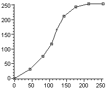
When the Stretch document opens, double-click on the straight line to add a number of points and drag them to a position so that your stretch resembles the one on the right.
You will see that the affect is to make the colours in the land and sea richer at the same time as the clouds appear brighter. The effect is to map the wide range of cloud values to a small range of display values at the top end of the 8-bit numerical display range. At the same time ocean pixels are mapped to a wider range of 8-bit values, particularly in the medium intensity range of the original display.
|
| B. |
Load the display again using Redisplay with an Autolinear stretch based on a selection that includes fewer cloud pixels. To do this you must first adjust the Autolinear stretch settings:
-
Open the Stretch menu and select Options;
-
In the Options dialog set the Autolinear Min % to 0
(you don't want to map any ocean pixels to black), and
-
set the Max % to 90.
(maps the 10% brightest percent of your selected pixels to white, which works well for a subselection with about 10% cloud and land.)
-
Press OK to accept the new settings.
Now clear the manual stretch you applied to the display in (A) above:
-
Open the Stretch menu again, and Clear the manual stretch you created in (A) above. The display should revert to the darker version you originally opened.
Select a box that contains only some cloud, preferably about 10% to match the current Autolinear settings:
-
Open the Edit menu and select Go To.
-
In the Go To dialog, set the (start) Position to X:560, Y:540,
-
make sure the Selection Type is Box Selection,
-
uncheck the Coords check box, and
- set the Selection Size to DX:500, DY: 370.
This draws a box on the image, which avoids some of the brighter clouds.
Finally change the Redisplay stretch loading the data into the 8-bit Bilko window, using the new Autolinear settings:
-
Right-click in the colour display window to open the Redisplay dialog,
-
change the Stretch used to Autolinear, and
-
press Apply to change all the stretch for all three bands.
If you have time, draw your own boxes in different areas of the image in an area with relatively little cloud and land, if so, you may notice that a box drawn on the opposite side of the image - antisolar direction - will give a different result.
|
| C. |
Try a histogram equalisation stretch when redisplaying the data. This type of stretch has been given this name because all the bins in the histogram of the display values contain approximately the same number of pixels, making the histogram appear a little like a rectangle.
-
Right-click on the colour display to open the Redisplay dialog, and
-
change the Stretch settings to use Equalize.
This again has the effect of making the sea areas brighter, in particular the bright turquoise coccolithophore bloom near the the South Africa East coast.
|
|
|
Answers:
(Resizable pop-ups)
Answer 1
Answer 2
Answer 3
Back up to:
Q1
Q2
Q3
|
Which of these stretches you would end up using for a particular image is to some extent a question of personal preference. It is also to some extent dependent on the relative proportions of cloud, land and sea in your image. In general, a logarithmic redisplay is a good start to look-see, but so is a histogram equalisation. In general, when cloud is present in an image, linear redisplays (including Autolinear) rarely work well, although as you have seen they may be reasonable if they are based on a subset that contains mainly sea.
Question 3
You may have noticed that in all these stretches the left of the image is bluer than the rest, and that the darkest sea areas are found in a broad central bands. Can you explain this? (You may find this
figure from ESA's MERIS Handbook useful when thinking about the answer.)
|


)
)